“The Amazing Power of Data Visualization, Augmented Reality and Social Discovery”, Hans Rosling
http://unitystoakes.blogspot.com/2011/01/amazing-power-of-data-visualization.html
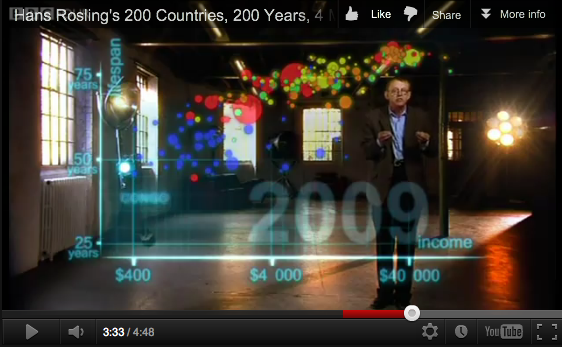
Ein schönes Beispiel von Informationsgrafik; aber ich denke, dass man hier die technischen Möglichkeiten von Feld der Augmented Reality noch freier Nutzen könnte. Meiner Ansicht nach ist diese Visualisierung zu nah an einem Video und einer 2D-Grafik.
December 5th, 2012
I would like to correct my earlier comment on Hans Rosling’s data visualisation. My mentor questioned my opinion above, and I think rightly so. For the non-german readers, to quote myself on what I said: ‘In my opinion, this visualisation is too close to a video and a 2D-graphic.’ In a purely technical way this might be true, but my comment does by far not give enough credit to Rosling’s work. He is the founder of gapminder.org, an organisation which is dedicated to ‘show the fact-based world-view’ http://www.gapminder.org/.
In this TED-talk http://www.gapminder.org/videos/religions-and-babies/ he works his magic with simple cardboard boxes for example to show the (non-) correlation between religion and childbirth-growth, and in what way the factor of income comes into the equation. If that is not ‘3D’, what could be?
Have a look and enjoy!